60
![]()
This is a collaborative post.
When it comes to home décor, the colours you choose will have a substantial impact on the result you eventually enjoy. Whether you’re looking to create a certain mood in a certain space, or you simply prefer one colour over another in general, the right colours can make a big difference.
But which colours complement each other? This is often determined through a process of trial and error. However, we can expedite this process by applying basic colour theory to quickly establish a theme that unifies a room, and enhances the visual harmony of the entire home.
Let’s delve into this, I assure you it’s going to be an intriguing read.
Understand the Colour Wheel and Basic Colour Theory
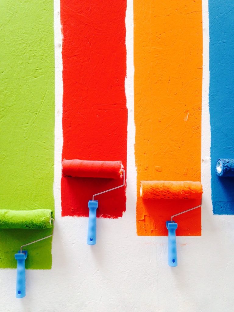
Colour theory allows us to determine which colours match with which. It’s all based around what’s called the colour wheel – which arranges different hues around a circular diagram. Colours that sit right next to one another will tend to work well, as will colours that are directly opposite one another. Think of all the film posters you’ve seen that make use of contrasting blue and orange.
Numerous online tools and visualisers that you may come across are utilised by designers of all types. They can assist you in selecting a few preferred colours and then identifying matching shades.
Consider the Purpose of Each Room
Of course, your choice of colour for a given space will need to reflect what you’re trying to get from that space. For a bedroom, you might want something soft and calming, like a pale sky blue. For a living room, you might want a little bit more energy and dynamism, which is why yellows can work.
In the case of spaces like the bathroom, the tiling can occupy as much visual space as the walls themselves, which is why it’s often a good idea to visit a bathroom showroom in search of inspiration.
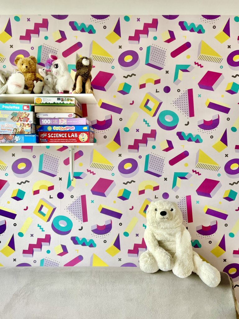
Balance Neutrals with Bold Accents
Opting for the safe choice of covering your home in bland, pale shades may result in a somewhat dull appearance, which may appeal to some. However, it would necessitate adding interest with hanging decorations. Conversely, an excess of bold, saturated colours can lead to a visually overwhelming environment, which might be too intense for many, although some may prefer it.
Frequently, the optimal strategy involves striking a balance between the two. Consider elements like feature walls and particular types of wallpaper that can subtly enhance a space without overpowering it.
Factor in Natural Light and Room Size
In reality, the rooms you’re decorating will be heavily influenced by the natural light that’s coming into them. In smaller spaces, lighter colours tend to be preferred, since they will tend to distribute natural light and make the space feel larger. If the room is big enough, you can take the opposite approach, and use darker hues to introduce a sense of intimacy.